Chapter 13 Introduction to ggplot2
One of the main reasons data analysts turn to R is for its strong data visualisation capabilities. The R ecosystem includes many different packages that support data visualisation. The three most widely used are: 1) the base graphics system, which uses the graphics package; 2) the lattice package; and 3) the ggplot2 package. Each system has its own strengths and weaknesses:
Base graphics is part of base R, which means it’s always available. It’s very flexible and allows us to construct more or less any plot we like. This flexibility comes at a cost, though. While it is certainly easy to get up and running with base graphics—there are specialised functions making common plots—building complex figures quickly becomes time-consuming. We have to write a lot of code to prepare even moderately complex plots, there are many graphical parameters to learn, and many of the standard plotting functions are inconsistent in how they work.
Deepayan Sarkar developed the lattice package to implement the ideas of Bill Cleveland in his 1993 book, Visualizing Data. The package implements something called Trellis graphics, a very useful approach for graphical exploratory data analysis. Trellis graphics are designed to help us visualise complicated, multiple variable relationships. The lattice package has many “high level” functions to make this process easy. The lattice package is very powerful, but it is hard to master.
Hadley Wickham developed the ggplot2 package to implement the ideas in a book called The Grammar of Graphics by Wilkinson (2005). It produces Trellis-like graphics but is quite different from lattice in the way it goes about this. It uses its own mini-language to define graphical objects, adopting the language of Wilkinson’s book to define these. It takes a little while to learn the basics, but once these have been mastered, it’s very easy to produce sophisticated plots with very little R code. The downside of working with ggplot2 is that it isn’t as flexible as base graphics.
We are not going to survey all these plotting systems. It’s entirely possible to meet most data visualisation needs by becoming proficient with just one of them. This book focuses on the ggplot2 package. In many ways, ggplot2 hits the ‘sweet spot’ between base graphics and lattice. It enables complex visualisations without the need to write many lines of R code, but remains flexible enough to allow the kind of customisation required to produce publication-quality figures.
13.1 The anatomy of ggplot2
The easiest way to learn ggplot2 is by using it. However, before we dive into ggplot2 code, we need to review the essential features of its ‘grammar’—the rules of how to specify a graph. This grammar is fairly abstract and won’t make much sense on first reading. That is fine. Ideas like ‘aesthetic mappings’ and ‘geoms’ will start to make sense as we work through various examples.
The design of ggplot2 reflects Wilkinson’s grammar of graphics. A complete ggplot2 object is defined by a combination of:
- one or more layers,
- a set of scales (one for each ‘aesthetic mapping’),
- a coordinate system (one per plot),
- a facet specification (if using a multi-panel plot).
The underlying idea is that we construct a visualisation by defining one or more layers. Each layer is associated with some data and a set of rules for how to display the data. Let’s review these components before moving onto the business of actually using ggplot2.
13.1.1 Layers
Each layer in a ggplot2 plot has five different components, though we don’t necessarily have to specify all of these because most have some kind of default setting:
The data. At a minimum, every plot needs some data. Unlike base R graphics, ggplot2 always accepts data in one format, an R data frame (or tibble). Each layer can be associated with its own data set. We don’t have to add data to each layer explicitly. If we choose not to specify the data set for a layer, ggplot2 will use the default data (if defined).
A set of aesthetic mappings. These describe how variables in the data are associated with the aesthetic properties of the layer. Aesthetic properties include things we perceive, such as position, colour, and size of the points. Each layer can be associated with its own unique aesthetic mappings. When we choose not to specify these for a layer ggplot2 will use the defaults (if defined).
A geometric object (a.k.a. ‘geom’). The geom part of layer tells ggplot2 how to represent the information—i.e. it refers to the objects we see on a plot, such as points, lines, bars or even text. Each geom only works with a particular subset of aesthetic mappings. We always have to define a geom when specifying a layer.
A statistical transformation (a.k.a. ‘stat’). A stat takes the raw data and transforms it in some way. A stat allows us to plot useful summaries of our raw data. We won’t explicitly use them in this book because we prefer to produce summary figures by first processing the data with dplyr. Nonetheless, the stat facility is often doing useful work in the background for some kinds of plots.
A position adjustment. These apply small tweaks to the position of layer elements. These are typically used when we need to define how the information for different categories are separated. For example, when making a bar plot, we may need to specify whether bars should be stacked on top of one another (the default) or plotted side-by-side.
13.1.2 Scales
The scale part of a ggplot2 object controls how the information in a variable is mapped to the aesthetic properties. A scale takes the data and converts it into variation we can perceive, such as an x/y location or the colour and size of points in a plot. The two most important things to understand about scales are:
- A scale must be defined for every aesthetic in a plot. It doesn’t make sense to define an aesthetic mapping without a scale because there is no way for ggplot2 to know how to go from the data to the aesthetics without one.
- When we include two or more layers, they all have to use the same scale for any shared aesthetic mappings. This behaviour is necessary to ensure information is displayed consistently.
If we choose not to explicitly define a scale for an aesthetic ggplot2 will use a default. This will often be a ‘sensible’ choice, which means we can get quite a long way with ggplot2 without ever really understanding scales. We will take a brief look at a few of the more common options, though.
13.1.3 Coordinate system
A ggplot2 coordinate system takes the position of objects (e.g. points and lines) and maps them onto the 2d plane a plot lives on. Most people are already very familiar with the most common coordinate system (even if they didn’t realise it). That’s the Cartesian coordinate system. This is the one we’ve all been using since we first constructed a graph with paper and pencil at school. All the most common statistical plots use this coordinate system, so we won’t consider any others in this book.
13.1.4 Faceting
The idea behind faceting is very simple. Faceting allows us to break a data set up into subsets according to the unique values of one or more variables and then produce a separate plot for each subset. The result is a multi-panel plot where each panel shares the same layers, scales, etc. The data is the only thing that varies from panel to panel. The result is a kind of ‘Trellis plot’, similar to those produced by the lattice package. Faceting is a very powerful tool that allows us to slice up our data in different ways and understand the relationship between different variables.
13.2 A quick introduction to ggplot2
Now that we’ve briefly reviewed the ggplot2 grammar, we can start learning how to use it. The package uses this grammar as the basis of a sort of mini-language within R. It uses functions to specify components like aesthetic mappings and geoms, which are combined with data to define a ggplot2 graphics object. Once we’ve constructed a suitable object, we can use it to display our graphic on the computer screen or save it using a common graphics format (e.g. PDF, PNG or JPEG).
Rather than orientating this introduction around each of the key functions, we’re going to develop a simple example to help us see how ggplot2 works. Many of the key ideas about how ggplot2 works can be taken away from this one example. Hence, it’s worth investing the time to understand it—i.e. use the example to understand how the different ggplot2 functions are related to the grammar outlined above.
Our goal is to produce a simple scatter plot. The scatter plot is one of the most commonly used visualisation tools in the EDA toolbox. A scatter plot uses horizontal and vertical positions (the ‘x’ and ‘y’ axes) to visualise pairs of related observations as a series of points in two dimensions. It’s designed to show how one numeric variable is associated with another. We’ll use the penguins data to construct the scatter plot. The questions we want to explore are:
- what is the relationship between bill depth and bill length, and
- how does this vary in relation to other variables?
13.2.1 Making a start
We will begin our work with ggplot2 by setting up a minimal graphical object. That’s a job for the ggplot function. Using ggplot without any arguments builds an empty graphical object:
# construct empty ggplot2 graphical object
plot_obj <- ggplot()
This constructs the skeleton object and assigns it a name, plot_obj. We can use the summary function to inspect the object to find out a bit more about it:
# print summary of empty graphical object
summary(plot_obj)
## data: [x]
## faceting: <ggproto object: Class FacetNull, Facet, gg>
## compute_layout: function
## draw_back: function
## draw_front: function
## draw_labels: function
## draw_panels: function
## finish_data: function
## init_scales: function
## map_data: function
## params: list
## setup_data: function
## setup_params: function
## shrink: TRUE
## train_scales: function
## vars: function
## super: <ggproto object: Class FacetNull, Facet, gg>The output of summary is quite verbose, but the important parts are near the top, just before the faceting: section. In this case, the ‘important part’ is basically empty. All we did was set up an empty graphical object—there are no data, aesthetic mapping, layers, etc associated with plot_obj.
It is not necessary to inspect the insides of every ggplot2 object with summary. However, it can be instructive to do this when first learning about the package.
ggplot2 vs. ggplot
Notice that the package is called ggplot2, but the actual function that does the work of setting up the graphical object is called ggplot. Try not to mix the names up—this is a common source of errors.
How can we improve on this? We could add a default data set. This is easy. We do it by passing the name of a data frame or tibble to ggplot. Let’s try doing this with penguins:
# construct ggplot2 graphical object with data
plot_obj <- ggplot(penguins)
Then print out the summary of the updated plot_obj:
# print summary of updated graphical object
summary(plot_obj)
## data: species, island, bill_length_mm, bill_depth_mm,
## flipper_length_mm, body_mass_g, sex, year [344x8]
## faceting: <ggproto object: Class FacetNull, Facet, gg>
## ...facet summary suppressed...We suppressed the facet information this time because it takes up a lot of space and we’re not interested in it. The important point is that the plot_obj summary now contains some information related to the data. The variables from penguins now comprise the data associated with the plot_obj object.
The next step is to add a default aesthetic mapping to the graphical object. Remember, this describes how variables in the data are mapped to the aesthetic properties of the layer(s).
One way to think about aesthetic mappings is they define what kind of relationships the plot will describe. Since we’re making a scatter plot, we need to define mappings for positions on the ‘x’ and ‘y’ axes. We want to investigate how bill depth depends on bill length, so we need to associatebill_length_mm with the x position and bill_depth_mm with the y position.
We define an aesthetic mapping with the aes function. One way to use aes is like this:
# add aesthetic mappings to graphical object
plot_obj <- plot_obj + aes(x = bill_length_mm, y = bill_depth_mm)
This little snippet of R code looks odd at first glance. There are a couple of things to take away from this:
- We can ‘add’ the aesthetic mapping to the
plot_objobject using the+operator. This has nothing to do with arithmetic. The ggplot2 package uses some clever programming tricks to redefine the way+works so that it can be used to combine graphical objects. It takes a bit of getting used to but this is useful because it makes building a plot from the components of the grammar very natural. - The second thing to notice is that an aesthetic mapping is defined by one or more name-value pairs, specified as arguments of
aes. The names on the left-hand side of each=refer to the properties of our graphical object (e.g. the ‘x’ and ‘y’ positions). The values on right-hand side refer to variable names in the data we want to associate with these properties.
Notice that we overwrote the original plot_obj object with the updated version using the assignment operator. We could have created a distinct object, but there’s usually no need to do this.
Once again, we can inspect the result using summary:
# print summary of updated graphical object
summary(plot_obj)
## data: species, island, bill_length_mm, bill_depth_mm,
## flipper_length_mm, body_mass_g, sex, year [344x8]
## mapping: x = ~bill_length_mm, y = ~bill_depth_mm
## faceting: <ggproto object: Class FacetNull, Facet, gg>
## ...facet summary suppressed...The data (data:) from the original plot_obj are still there, but now we can also see that two default mappings (mapping:) have been defined for the x- and y-axis positions. We have successfully used the ggplot and aes functions to set up a graphical object with both default data and aesthetic mappings.
Any layers that we now add will use these data and mappings unless we choose to override them by specifying different options.
We now need to specify a layer to tell ggplot2 how to visualise the data. Remember, each layer has five components: data, aesthetic mappings, a geom, a stat and a position adjustment. Since we have already set up the default data and aesthetic mappings, there’s no need to define these again—ggplot2 will use the defaults if we leave them out of the layer definition. This leaves the geom, stat and position adjustment.
What kind of geom do we need? A scatter plot allows us to explore a relationship as a series of points. That means we need to add a layer that uses the ‘point’ geom. Simple.
What about the stat and position? Not so simple. These are difficult to explain without drilling down into how ggplot2 works. A key insight is that both the stat and the position adjustment change the data somehow before plotting it. When we want to stop ggplot2 from doing anything to our data, the keyword is ‘identity’. We use this value whenever we want ggplot2 to plot the data without modification.
We will examine the easy way to add a layer in a moment. However, we’ll use the long-winded approach first because this reveals what happens whenever we build a ggplot2 object. The general function for adding a layer is simply called layer. Here’s how it works in its most basic usage:
# add layer to graphical object -- using points geom
plot_obj <- plot_obj + layer(geom = "point", stat = "identity", position = "identity")
This adds a layer to the existing plot_obj object with the layer function and overwrites the old version. Again, we add the new component using the + symbol. We set three arguments of the layer function:
- define the geom: the name of this argument was
geomand the value assigned to it was"point". - define the stat: the name of this argument was
statand the value assigned to it was"identity". - define the position adjustment : the name of this argument was
positionand the value assigned to it was"identity".
Let’s review the structure of the resulting graphical object one last time to see what we’ve achieved:
# print summary of updated graphical object
summary(plot_obj)
## data: species, island, bill_length_mm, bill_depth_mm,
## flipper_length_mm, body_mass_g, sex, year [344x8]
## mapping: x = ~bill_length_mm, y = ~bill_depth_mm
## faceting: <ggproto object: Class FacetNull, Facet, gg>
## ...facet summary suppressed...
## -----------------------------------
## geom_point: na.rm = FALSE
## stat_identity: na.rm = FALSE
## position_identityThe text above the ----- line is the same as before. It summarises the default data and the aesthetic mapping. The text below it summarises the layer we just added. This tells us that layer uses the points geom (geom_point), the identity stat (stat_identity), and the identity position adjustment (position_identity).
Now plot_obj has everything it needs to render a figure. How do we do this? Simply ‘print’ the graphical object:
# 'print' graphical object to show it
print(plot_obj)
## Warning: Removed 2 rows containing missing values (`geom_point()`).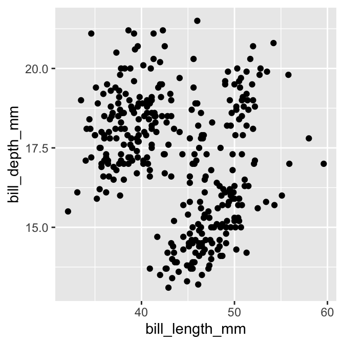
That’s it! We have produced a scatter plot showing how bill depth is associated with bill length. It seems a little odd to show a plot by ‘printing’ it but that’s just how ggplot2 works. It soon starts to feel natural with practise.
Notice that ggplot2 printed a warning. That is nothing to worry about. It is just letting us know a couple of rows in the data were ignored because they contained missing values. We will suppress that message from now on because it gets a bit irritating.
Here’s a quick summary of what we did, all in one place:
# step 1. set up the skeleton graphical object with a default data set
plot_obj <- ggplot(penguins)
# step 2. add the default aesthetic mappings
plot_obj <- plot_obj + aes(x = bill_length_mm, y = bill_depth_mm)
# step 3. specify the layer we want to use
plot_obj <- plot_obj + layer(geom = "point", stat = "identity", position = "identity")
# step 4. show the plot
print(plot_obj)
Don’t use this workflow!
It’s possible to construct any ggplot2 visualisation using the workflow outlined in this subsection, but this is not the recommended approach. The workflow we adopted here was used to reveal how the grammar works, rather than its efficiency. A more concise, standard approach to using ggplot2 is outlined next. Use that for real-world analysis.
13.3 A standard way of using ggplot2
The ggplot2 package is quite flexible, which means we can specify a visualisation in more than one way. To keep life simple, we’re going to adopt a consistent workflow from now on. This won’t reveal the full array of ggplot2 tricks, but it is sufficient to construct a wide range of standard visualisations. Let’s make the same bill depth vs. bill length scatter plot again to see the workflow in action.
We began building our ggplot2 object by setting up a skeleton object with a default data set and then added the default aesthetic mappings. There is a more concise way to achieve the same result:
# create graphical object with data and aesthetic mappings
plot_obj <- ggplot(penguins, aes(x = bill_length_mm, y = bill_depth_mm))
In this form, the aes function appears inside ggplot as a second argument. This sets up a graphical object with default data and aesthetic mappings in a single step. We will always use this approach from now on.
The next step adds a layer. We saw that the layer function could be used to construct one from its component parts. However, ggplot2 provides many convenience functions that construct layers according to the type of geom they need. They all look like this: geom_TYPE, where TYPE stands for the name of the geom we want to use. For example, a point geom is specified using geom_point. Using this function, an alternative to the last line of the example is therefore:
# use geom_point to add a points layer to graphical object
plot_obj <- plot_obj + geom_point()
We didn’t have to specify the stat or the position adjustment components of the layer because the geom_TYPE functions all use reasonable defaults. These can be overridden if needed, but most of the time, there’s no need to do this. This way of defining a layer is much simpler and less error-prone than the manual layer method. We will always use the geom_TYPE method from now on.
There’s one last trick we need to learn to use ggplot2 efficiently. We’ve been building a plot object in several steps, giving the intermediates the name plot_obj, and then manually printing the object to display it when it’s ready. This is useful if we want to make different versions of the same plot. However, we very often just want to build the plot and display it in one go. This is done by combining everything with + and printing the resulting object directly:
# display bill morphology scatter plot **in one step**
ggplot(penguins,
       aes(x = bill_length_mm, y = bill_depth_mm)) +
  geom_point()
That code builds the ggplot2 graphical object and renders it in one go. We didn’t even have to use print to generate the output. There is a lot is going on in the background, but this small snippet of R code contains everything ggplot2 needs to construct and display a simple scatter plot.
What does this scatter plot actually tell us about penguin bill morphology? It seems to suggest there isn’t much of a relationship between bill depth and bill length. Does that seem sensible? Maybe we need a more informative plot.
Plotting incomplete ggplot2 objects
It is instructive to see what happens when we render an incomplete graphical object. The four panels below show the output produced by a) an empty ggplot2 object, b) a partially complete ggplot2 object with only data, c) a partially complete ggplot2 object with data and aesthetics, and d) a complete ggplot2 object with data, aesthetics and a geom. The actual code to make each one is shown in the title area.
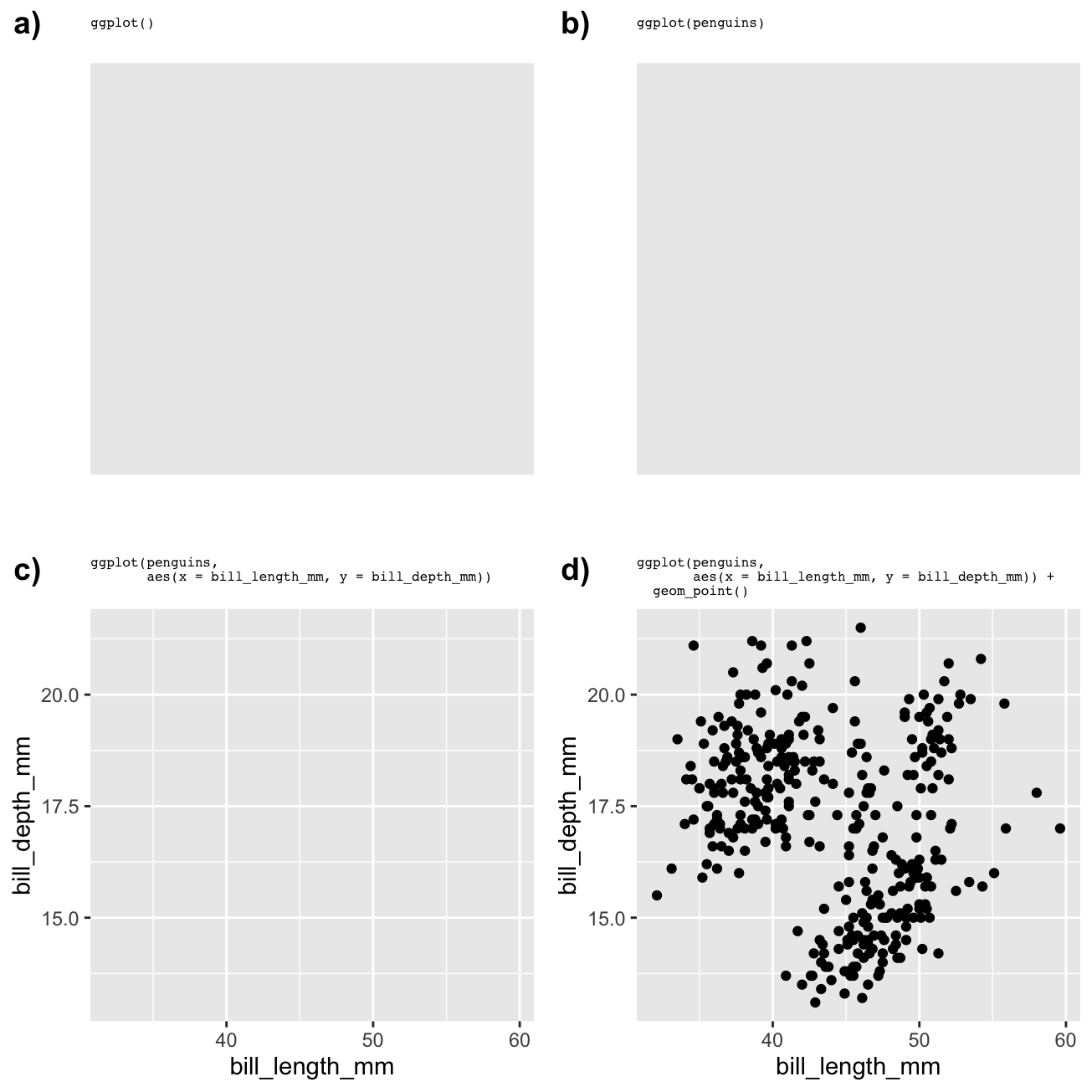
We can see that ggplot2 will try to plot something with the information it has, but we only end up with an informative plot when we specify data, aesthetic mappings, and a geom. That is the minimum we need to specify to arrive at a useful plot.
13.3.1 How should we format ggplot2 code?
Take another look at that last example. We split the ggplot2 definition over two lines, placing each function on its own line. R doesn’t care about those extra newlines. As long as we put a + at the end of a line R will assume the next line is part of the same plot definition. Splitting the different parts of a graphical object definition across lines like this makes everything more readable and helps us spot errors.
Once we split the definition across lines we can place comments between the lines of ggplot2 code. For example, we could add comments to state what the aes and geom_point parts are doing:
# display bill morphology scatter plot
ggplot(penguins,
       # bill depth (y) vs bill length (x)
       aes(x = bill_length_mm, y = bill_depth_mm)) +
  # add points layer
  geom_point()
It’s a very good idea to format and document ggplot2 code in this way. That way, when we come back to it after a while, we can remember what we were trying to achieve! We will always use these conventions from now on.
13.4 Increasing the information density…
One of the great strengths of ggplot2 is the ease with which it allows us to incorporate information from several variables into a single plot. So far, we have made a simple two-variable scatter plot to examine bill morphology—the bill depth-length relationship. There are clearly other variables in the penguins data set that might influence this relationship. In this section, we will highlight three approaches for including additional variables in a visualisation. That is, we will see how to increase the information density of a plot.
13.4.1 …via aesthetic mappings
The most straightforward way to increase the information in a plot is by mapping a new variable to an unused aesthetic. For example, how might we learn whether the bill depth-length relationship varies by penguin species? We need to include information in the species variable in our scatter plot somehow. One option is to map the species to the colour aesthetic, so that the colour of the points correspond to different species. We do this by altering the aes part of the plot specification:
# display bill morphology scatter plot
ggplot(penguins,
       # bill depth (y) vs bill length (x) by species (colour)
       aes(x = bill_length_mm, y = bill_depth_mm, colour = species)) +
  # add points layer
  geom_point()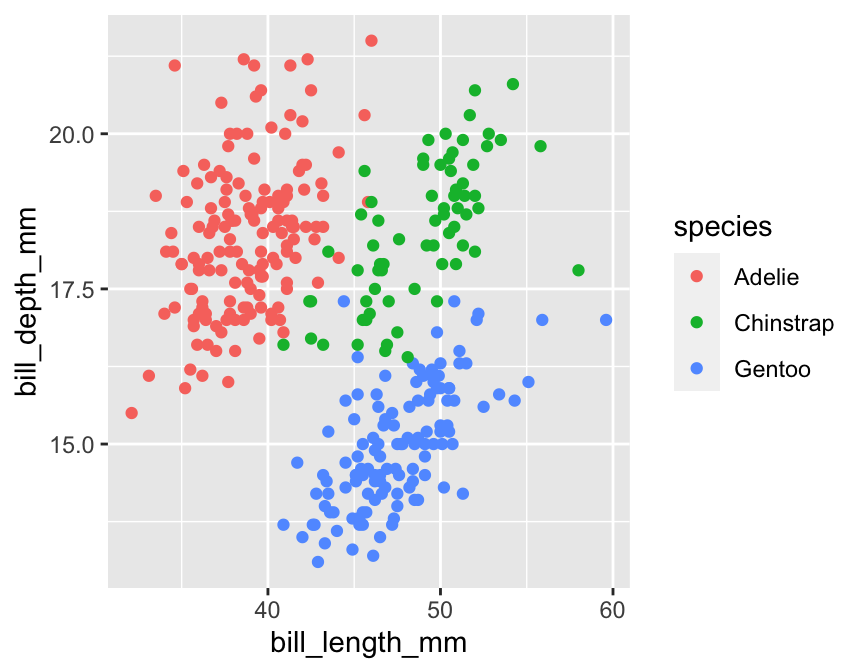
Individual points are now coloured according to the species they belong to. Notice ggplot2 also adds a legend. This plot shows that bill morphology is reasonably species-specific. Separating things by species suggests a (mild) positive association between bill length and bill depth within species. This was not apparent before because it was hidden by the among species pattern.
We put the aes argument on a new line in this example because the first line was getting a bit long. This is only a readability thing—the aes part still belongs to ggplot.
We could certainly improve this visualisation. Nonetheless, it illustrates an important concept: we can add information to a plot by mapping additional variables to new aesthetics. There is nothing to stop us from using different aesthetics if we wanted to squeeze even more information into this plot. For example, we could map the sex variable (sex) to the point shape using shape = sex inside aes:
# display bill morphology scatter plot
ggplot(penguins,
       # bill depth (y) vs bill length (x) by species (colour) + sex (shape)
       aes(x = bill_length_mm, y = bill_depth_mm, colour = species, shape = sex)) +
  # add points layer
  geom_point()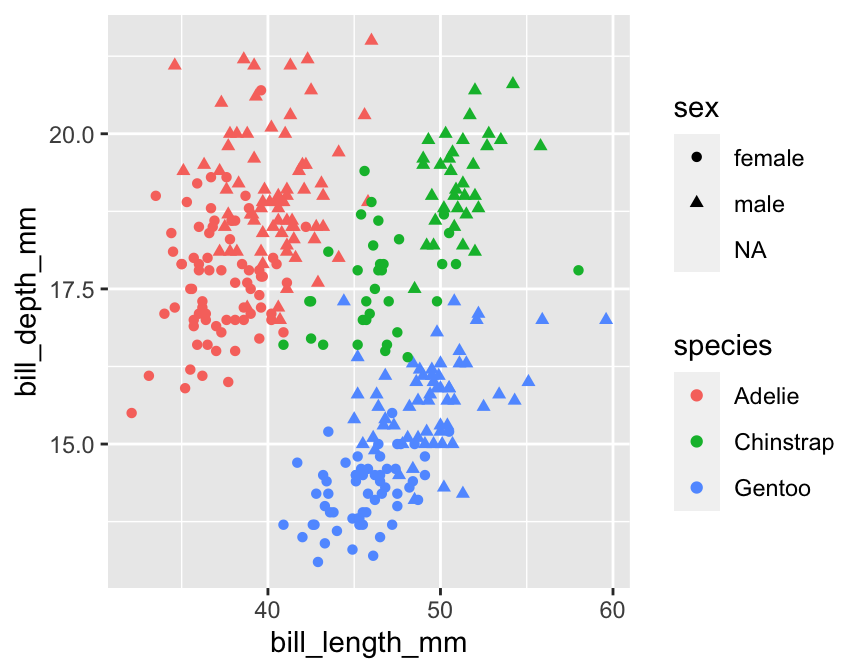
13.4.2 …via facets
A second way to increase the amount of information on display is by making separate plots for meaningful subsets of the data. We can use the faceting facility of ggplot2 to do this. Faceting allows us to define subsets of data according to the values of one or more variables and produce a separate plot for each subset, all without having to write much R code.
Faceting operates on the whole figure, which means we can’t apply it by changing the properties of a layer. Instead, we have to use a new function to add the faceting information. There are two different ways to facet in ggplot2:
facet_wrapforms a matrix of panels by wrapping the 1d sequence of panels into a 2d matrix with rows and columns. It is typically used with a single categorical faceting variable (though it works with two or more faceting variables).facet_gridforms a 2d matrix of panels defined by row and column variables. It is typically used when we have two or more categorical variables, and all combinations of the variables exist in the data.
This is best understood by example. What if we want to see how the bill morphology varies across islands? Here’s how we split things up by island using the facet_wrap function:
# display facetted bill morphology scatter plot
ggplot(penguins,
       # species info via colour aesthetic
       aes(x = bill_length_mm, y = bill_depth_mm, colour = species)) +
  # add points layer
  geom_point() +
  # island info via facets
  facet_wrap(vars(island))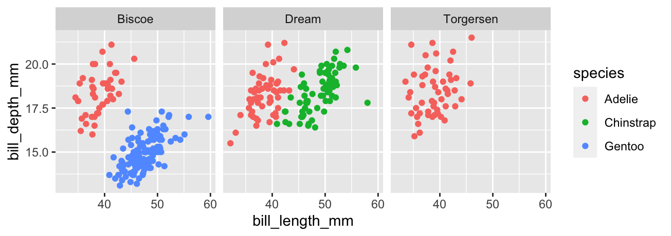
That first vars(island) argument of facet_wrap says to split up the data set according to the values of island. Simple. Notice that the panels share the same scales for the ‘x’ and ‘y’ axes. Using a common scale makes it easy to compare bill morphology across islands, but this can also be changed if necessary. For example, setting scales = "free" would ensure each panel uses its own x/y scale.
The plot indicates that bill morphology is roughly invariant across the three islands. It also inadvertently reveals something else about these penguins—the Gentoo and Chinstrap species are only found on a single island, which is different for each one, whereas Adelie penguins are found on all three islands. That’s one reason exploratory analysis is so important—it throws up unexpected findings.
13.4.3 …via multiple layers
A third way to add additional information to a plot is by including multiple layers. So far, we have only seen examples with a single layer—only one geom_ function is involved in creating the plot. There is no reason we can’t add multiple layers to a plot by ‘adding’ two or more geom_ functions. We’re not yet in a position to demonstrate how to make such multi-layer plots because they require additional skills covered in later chapters. However, as a taster, here is an example of the kind of thing we can do with this idea (we have deliberately hidden the code):
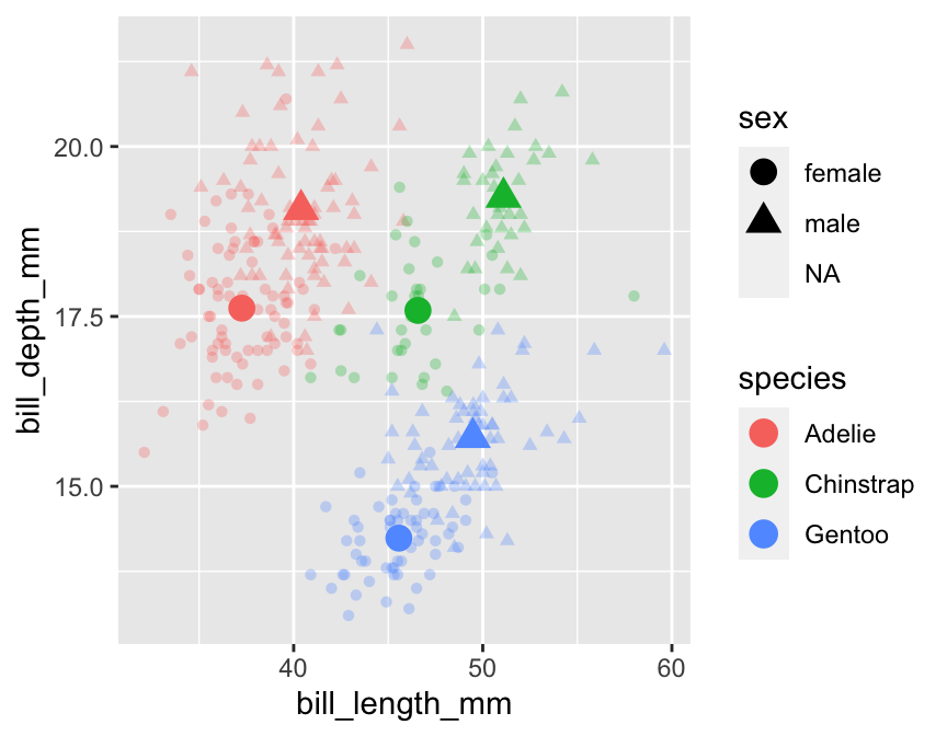
This shows how bill morphology varies by penguin species and sex, but now these relationships are summarised in two points layers. The first layer displays the raw data (small transparent points). The second layer adds the species/sex-specific means (large solid points). This places the average differences in the context of the overall variation in the raw data. Nice!