Chapter 21 Regression diagnostics in R
We learnt how to interpret some practical regression diagnostic plots in the last chapter. It was quite a lot of work to make each one of these. Fortunately, there is no need to do all that work each time we fit a new model. R has a built-in facility to make these diagnostic plots for us using only a model object. This chapter will walk through how to use this workflow with the regression and one-way ANOVA models from earlier chapters.
21.1 Diagnostics for regression
We’ll use the glucose release example from the earlier Simple regression chapter to step through the easy way to make diagnostic plots.
We assume the data from ‘GLUCOSE.CSV’ have been read into a tibble called vicia_germ and the associated regression model has been fitted as before:
Create vicia_germ and vicia_model if you plan to work along.
The built in facility for diagnostic plots in R works via a function called plot. It is easy to use. For example, to produce a residuals vs fitted values plot, we use:
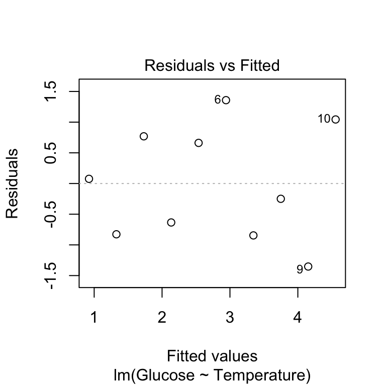
The first argument is the name of fitted model object. The second argument controls the output of the plot function: which = 1 argument tells it to produce a residuals vs fitted values plot. The add.smooth = FALSE is telling the function not to add a line called a ‘loess smooth’. This line is supposed to help us pick out patterns, but it tends to overfit the relationship and causes people to see problems that aren’t there. For this reason, it’s often better to suppress the line.
Remember that this plot allows us to evaluate the linearity assumption: we’re looking for any evidence of a systematic trend (e.g. a hump or U-shaped curve) here. Because there is no obvious pattern, we can accept the linearity assumption and move on to the normality assumption.
We use the plot function to plot a normal probability diagnostic by setting which = 2:
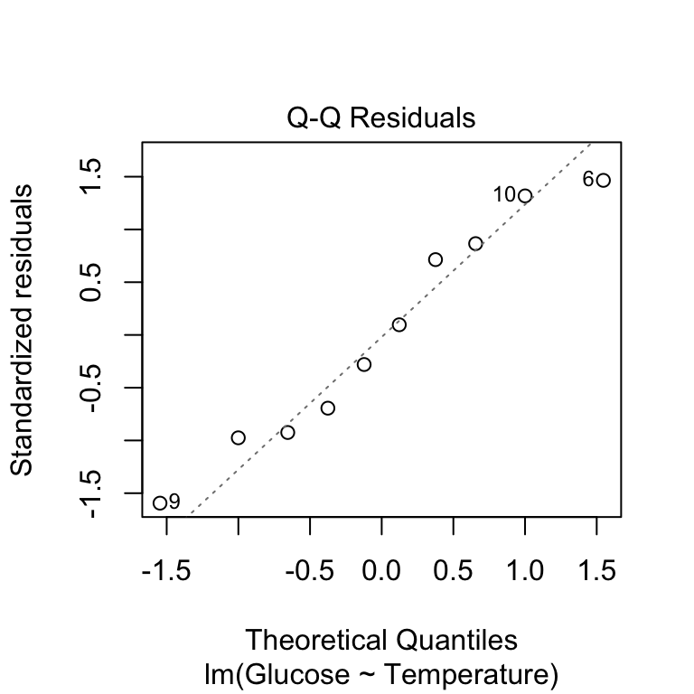
This produces essentially the same kind of normal probability plot we made in the previous chapter, with one small difference. Rather than drawing a 1:1 line, the ‘plot’ function shows us a line of best fit. This allows us to pick out the curvature a little more easily. There’s nothing here to lead us to worry about this assumption—the points are close to the line with no systematic trend away from it.
Finally, we can produce a scale-location diagnostic plot using the plot function to assess the constant variance assumption. Here we use which = 3 and again we suppress the line (using add.smooth = FALSE) to avoid finding spurious patterns:
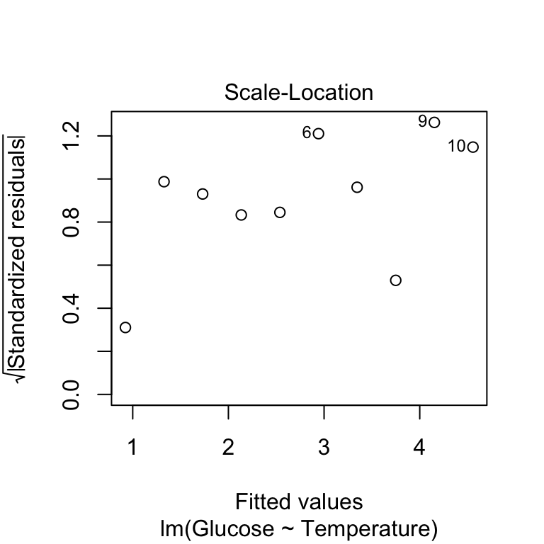
We’re looking for any sign of the size of the transformed residuals either increasing or decreasing as the fitted values get larger. This plot looks good—as the relationship here looks pretty flat, we can conclude that the variability in the residuals is constant.
Don’t panic if your diagnostics aren’t perfect!
The good news about regression is that it is quite a robust technique. It will often give reasonable answers even when the assumptions are not perfectly fulfilled. We should be aware of the assumptions but not become too obsessed with them. If the violations are modest, it is often fine to proceed. Of course, we have to know what constitutes a ‘modest’ violation. There are no hard and fast rules—the ability to make that judgement comes with experience.
21.2 Diagnostics for one-way ANOVA
We pointed out in the previous chapter that the term ‘regression diagnostic’ is misleading because an equivalent set of diagnostic plots can be produced for any general linear model. This includes one-way ANOVA models. We’ll use the corncrake density example from the One-way ANOVA chapter to demonstrate this.
We assume the data from ‘CORN_CRAKE.CSV’ have been read into a tibble called corn_crake and the associated one-way ANOVA model has been fitted as before:
Create corn_crake and corncrake_model if you plan to work along.
The first diagnostic plot we produced for the regression model above is the residuals vs fitted values plot. In a regression, this is used to evaluate the linearity assumption. What does it do in a one-way ANOVA? Not much of use to be honest. There isn’t much point making a residuals vs fitted values plot for a one-way ANOVA. Why? Because the residuals will never show a trend with respect to the ‘fitted values’, which are just the group-specific means. That’s one thing less to worry about.
The normal probability plot is used to identify departures from normality. This plot allows us to check whether the residuals—the deviation of each point from its group’s mean—are likely to have been drawn from a normal distribution. Here’s the normal probability plot for our example:
This looks very good. The points don’t deviate from the line systematically, except for a couple at the lower end (that’s not unusual), so it looks like the normality assumption is satisfied.
The scale-location plot allows us to evaluate the constant variance assumption. This allows us to see whether or not the variability of the residuals is roughly constant within each group. Here’s the scale-location plot for the corncrake example:
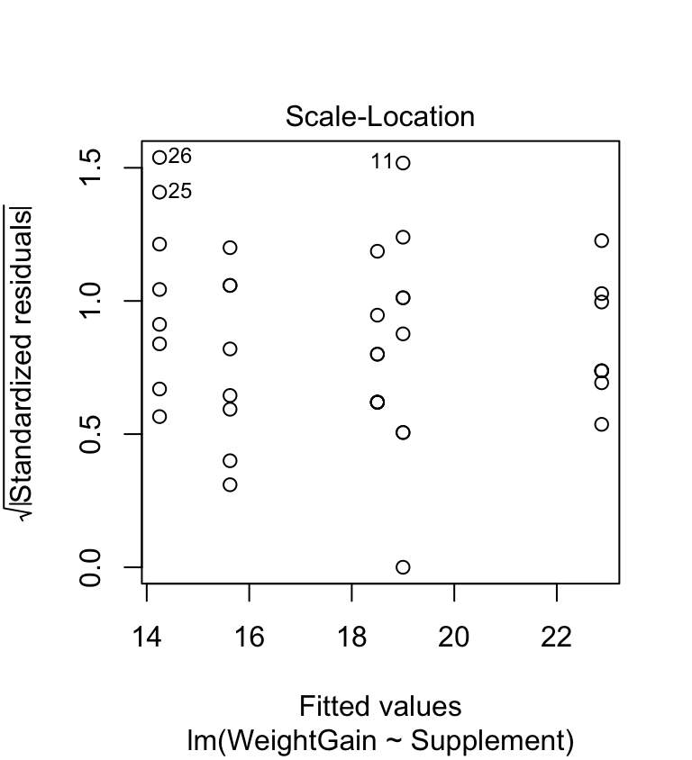
The warning sign we’re looking for here is a systematic pattern. We want to see if the magnitude of the residuals tends to increase or decrease with the fitted values. If such a pattern is apparent, then it suggests that variance changes with the mean. There is no such pattern in the above plot, so the constant variance assumption is satisfied.
21.3 Can we test equality of variance?
Looking back over the scale-location plot, it seems like three of the groups exhibit similar variability, while the remaining two are different. They aren’t wildly different, though, so it is reasonable to assume the differences are due to sampling variation. Unfortunately, some people are uncomfortable using this sort of visual reasoning. They want to see a p-value to back up the decision to proceed.
We think this is a bad idea. Here is the reason why. Formal tests of equality of variance are not very powerful. This means that to detect a difference, we either need a lot of data, or the differences need to be so large that they would be easy to spot using a graphical approach. The test is a crutch that we don’t need.
That said, some people will demand to see a statistical test evaluating the equality of variance assumption. Several such tests exist but the most widely used is the Bartlett test:
##
##  Bartlett test of homogeneity of variances
##
## data:  WeightGain by Supplement
## Bartlett's K-squared = 3.6444, df = 4, p-value = 0.4563
This looks just like the t-test specification. We use a ‘formula’ (WeightGain ~ Supplement) to specify the response variable (WeightGain) and the grouping variable (Supplement), and use the data argument to tell the bartlett.test function where to look for these variables. The null hypothesis of a Bartlett test is that the variances are equal, so a non-significant p-value (>0.05) indicates that the data are consistent with the equal variance assumption. That’s what we find here.